
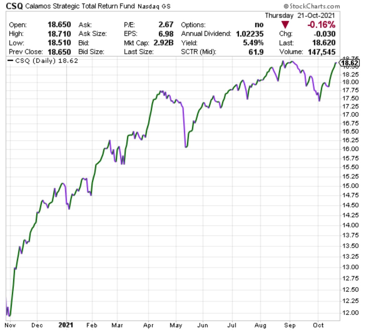
A price chart is a sequence of prices ploted over a specific timeframe; information is shown at the top, prices on the right and time at the bottom. A price chart can plot the price of almost anything, including the cost of a head-of-lettuce, over any selected period of time. Shown below is what you want to see on a stock price chart. CSQ is one of our portfolio holdings and it has an almost identical price chart to our other closed-end-fund (CEF) holdings of RNP and ACV. Over just the past 12 months, CSQ started at a price of $12 per share and it is now $18.62 per share for a 12 month gain of roughly 55% and it also paid 5.5% in interest payments directly into client accounts. This was accomplished despite having lower risk than does the S&P-500. You want to see chart price lines moving up from lower left to upper right.
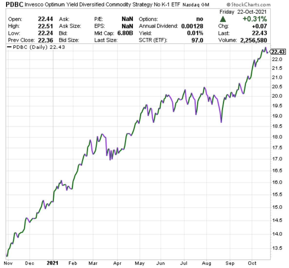
PDBC is our commodities fund. We picked this particular fund because it does not exploit animals as commodities and it sometimes pays interest (I’ve seen the yield as high as 2.5%) and it has no complicated K-1 tax form. And we like this type of fund because it merely sets its value based on the price of commodities and it does not participate in the actual mining, drilling, lumbering or basic exploitation of the environment. Notice how PDBC moves differently than CSQ so it helps to smooth out the path of profits; sometimes when stocks and bonds drop, PDBC will go up. PDBC has gained 70% in the past 12 months (try beating this via flipping houses!):
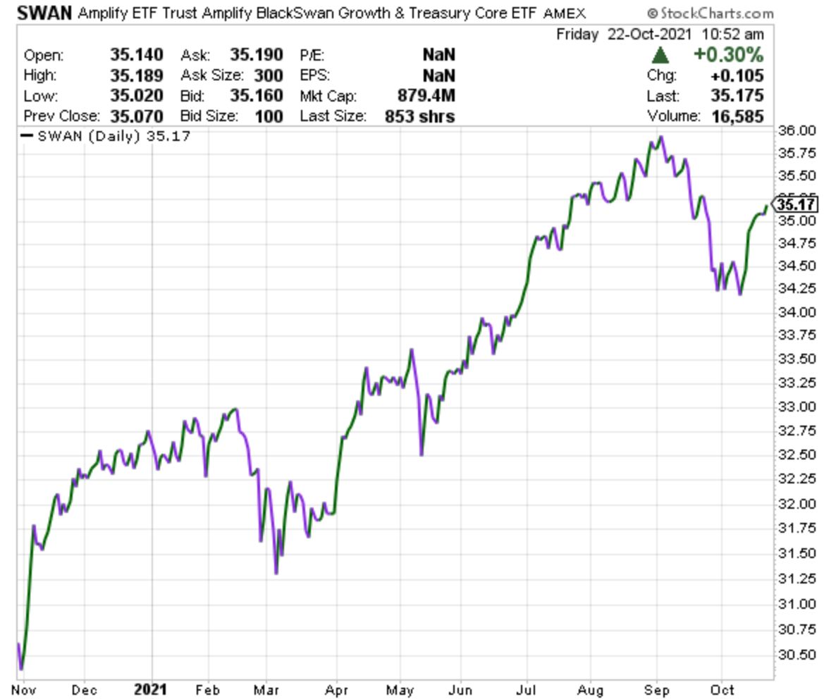
SWAN is an example of a protective portfolio asset that MarketCycle also holds. Like CSQ, it also moves from lower left to upper right, which is good, but it was less profitable during the past 12 months because it generates most of its outperformance when markets correct, and there has not been any meaningful stock market correction during the past year. Still, it is doing its job while making another 20% in profit in just 12 months (similar to the gains on our gold-bullion trust holding).
From CNBC as reported in the October 29, 2021 issue of The Week: “The wealthiest 10% of Americans now own 89% of all U.S. stocks held by households, a record high. The top 1% of all Americans gained more than $6.5-trillion in the stock market since the Covid-19 pandemic began, while the bottom 90% made $1.2-trillion, according to the latest data from the Federal Reserve.”
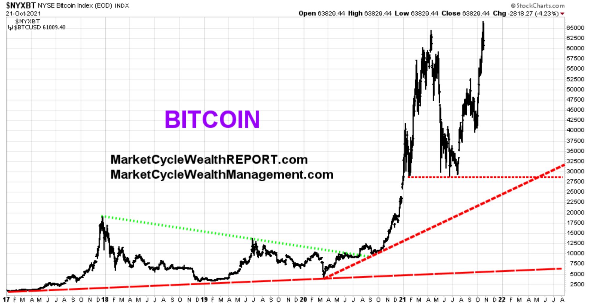
On Tuesday October 19th, the stock market suddenly became very strong again. Very strong. We had predicted a September pullback and MarketCycle used the opportunity to add to account positions with new client money; we did so on the exact day of the pullback bottom and the stock market has marched straight up from that day to today. MarketCycle recently sent out a private Client Market Update with a list of our near-term predictions and they all proved to be correct except for our call for bitcoin to move lower. Bitcoin rose instead when it got wind of the news that a new bitcoin ETF (BITO) had been approved by the SEC and was about to come out (and 8 similar ETFs are in the works). A chart of bitcoin will be presented further below.
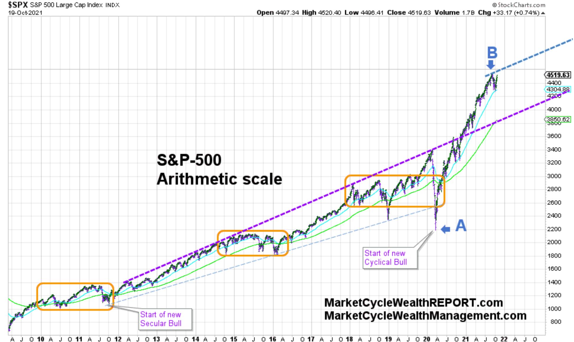
I have to use several services to gather and assemble all of the information that I need each day, but I usually present StockCharts in my blogs because the charts are so clean. In March of 2020 (when we were still at point “A” on the chart below) I drew the new upper trend channel line (indicated by “B“) of where I thought that the stock bull market was headed; at the time this line was just sitting all alone out in chart-space. I wrote repeatedly about this by saying that the S&P-500 would soon head up to between 4500 and 4600, depending on how rapidly it moved higher; it ultimately hit 4550 before pulling back (right in the middle of my prediction range) and the S&P-500 re-touched this 4550 number again on Thursday October 21st and then closed at a new record high. If my predictions remain on track, we will have over 1000 new record highs over the next 8 years. And we should expect the S&P-500 to hit 4700 before the Spring of 2022.
So, the S&P-500 will likely churn higher, moving along the bottom side of the “B” line shown below for the next couple of years. It did the same thing in 2013 & 2014. The bull charges ahead!
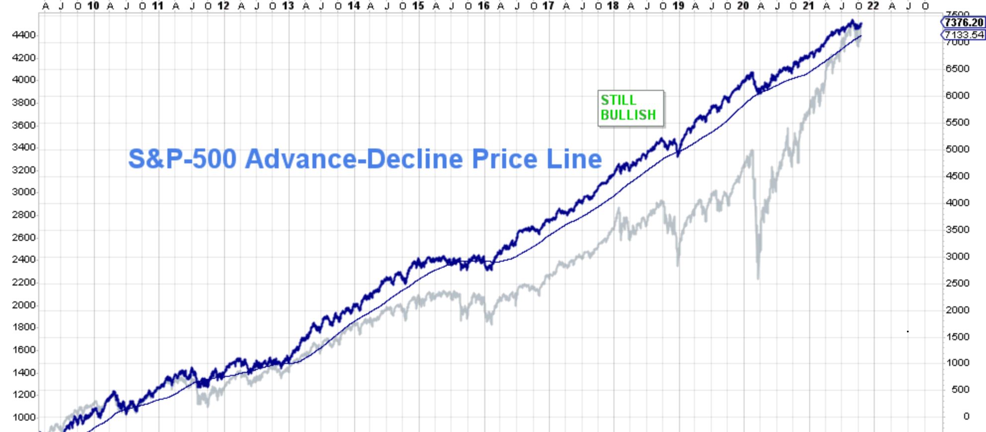
The all important S&P-500 Advance/Decline Price Line (which shows the breadth of market participation… it reveals whether a market is running on all cylinders), as it has done since March of 2009, it is still saying that we are in a Secular stock bull market. The S&P-500 is superimposed as a grey line:
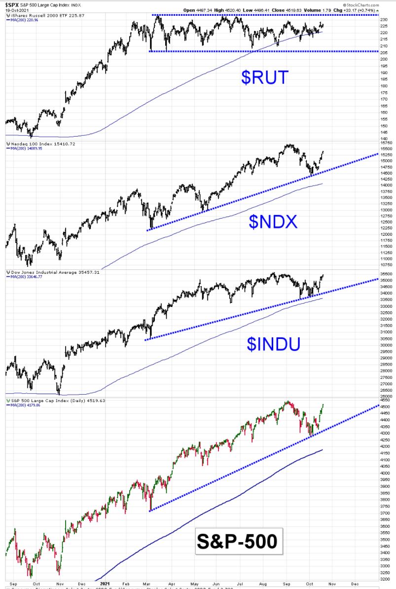
In the near-term, all U.S. stock indexes remain above their individual short-term trendlines (blue dashed lines below). A trendline is just a line, usually at around 45 degrees, that indicates market direction and once established the markets tend to want to touch the line repeatedly. Small cap stocks (labeled as $RUT below) are showing weakness but this is only natural as we now leave the early-cycle and enter the mid-cycle portion of the current market cycle. The pundits on the financial sites are out promoting “cheap” small-cap stocks, but sometimes certain stocks (or even entire categories of stocks) are cheap for a reason.
Market strength: The United States continues to lead in strength relative to all other regions of the globe. The U.K. is also surprisingly strong. The most recent stock bull market started in late March of 2020 and it still has a long way to go before it reaches the end of this market cycle. We have left the early-cycle and are entering the mid-cycle where stocks will continue to plow ahead, but in a slightly slower and more choppy manner. $3.5-trillion is still sitting on the sidelines in the United States; it is waiting to go into the markets or to be spent in the economy. Low interest rates plus strong cash levels = stocks to go higher.
Market weakness: The only major countries showing measurable current economic distress are: Canada, Luxembourgh, China, Argentina and Brazil.
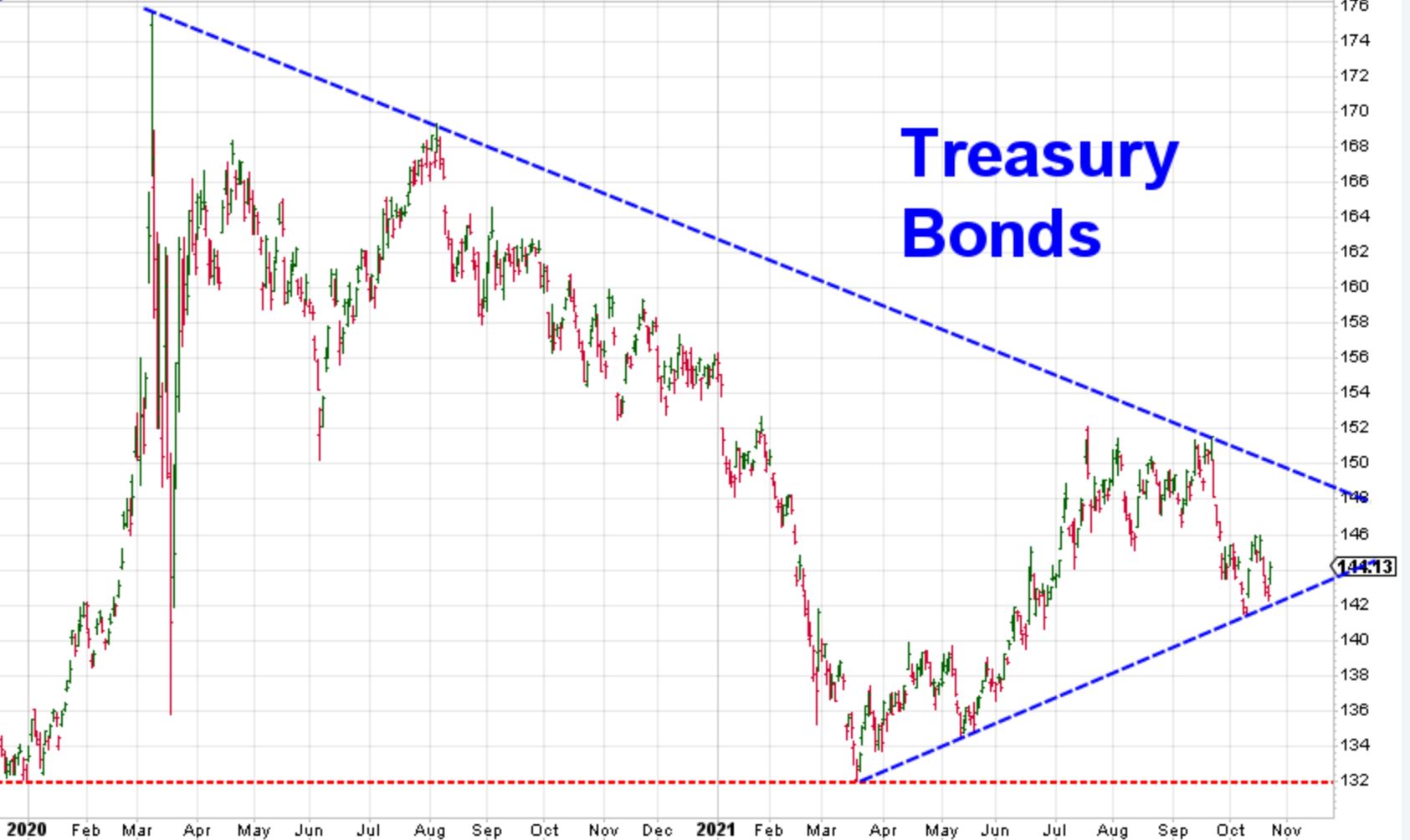
Fixed-rate bonds often move in the opposite direction of stocks. The main reason that bonds are held in investment portfolios is because they usually go up when stocks go down. The most likely near-term direction for bonds is lower and perhaps down to the red dashed line on this next chart. So, they will likely move down as stocks move higher. Generalized fixed-rate bond weakness will likely persist for the next 15-ish years. Roughly speaking, for each & every 1% rise in bond yields, the value of your fixed-rate bonds will go down by 10%. Ouch. We are just now coming out of the biggest bond bubble in the history of the universe; it was 40 years in the making.
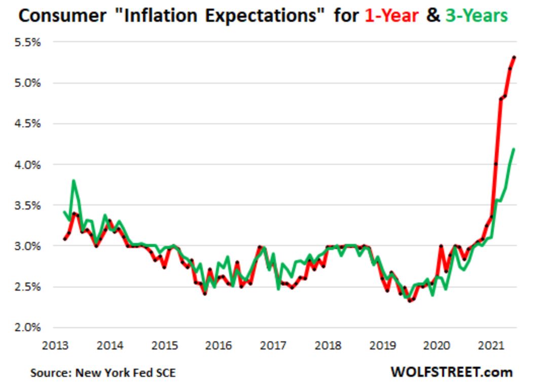
Inflation means that the prices of everything that we consume, both goods and services, are heading higher. Inflation is caused by supply chain disruptions and/or by money printing. 14% of all of the USDollars ever printed were created during the past 12 months. The good news is that wages also generally head higher during inflationary periods (although automation and robotics will ultimately keep a lid on the wage gains of real people). MarketCycle’s system of indicators were the first that I know of to pick up on the current inflation story. We saw it way back in March of 2020 and now it is the only story that anyone is talking about. Our indicators tell us that inflation persists. Although we may be wrong about this, over the longer term MarketCycle expects (roughly) three temporary inflation spikes, perhaps spaced two years apart, before inflation then just steadily grinds higher during the 2030’s. We are experiencing the first inflation spike right now.
Two great books on inflation & deflation:
- Inflation Matters… by Pete Comley (Pete is a great guy that lives in the U.K. and he is a reader of this blog)
- The Great Devaluation… by Adam Baratta
High inflation and falling bonds: People that hold the typical 60%-stock/40%-bond portfolios (60/40 is the most common portfolio mix) or that simply hold a template of mixed assets (such as the ones that companies like Wells Fargo put out) or that invest in “can’t fail index ETFs & mutual funds” are all going to get punished going forward and for the next several decades. Starting right now is the time that alpha-level professional help will really pay for itself. My prediction is that the S&P-500 will no longer lead; you can no longer just “buy the market.” Going forward, sector and factor selection for outperformance becomes of the utmost importance.
Interest rates? MarketCycle has discovered how to accelerate the same data that the Federal Reserve looks at so that we know, ahead of them, what their next move will be. Our indicators just changed to show that the Fed could now raise rates at any time. The likely path would be to start with visible tapering in November, although they have already been secretly tapering for months. Certainly there will be rate increases in early 2022, if not by late 2021.
Bitcoin is getting closer to forming a new price top. Parabolic tops always correct rapidly once they start. Nothing can go straight up forever and the faster & higher it rises now, the faster & lower it will fall in the future. IMO, it should head lower sooner rather than later, perhaps down to 27,500 and this would be a greater than 50% loss, but it could drop down to any of the red dashed lines shown below, including all of the way down to 7000. Charting bitcoin is problematic; this is an ‘asset’ that is actually only a ‘digit’ saved in one’s computer, so it ultimately could go as high or as low as the majority of (mostly young) traders imagine. It is not really a usable currency and it will likely never be one simply because it is way, way too volatile and therefore offers no stability; currencies must hold a relatively stable value.

Bitcoin is an asset that consists of nothing tangible when almost every other investment asset represents something real and tangible, stocks are partial ownership in a corporation and gold can be held in one’s hand, but if bitcoin dropped to $7000 again I would be a buyer (or perhaps buy ethereum). Cathie Wood of ARK Investments optimistically believes that “bitcoin will go to $500,000 in 5 years.” The much respected Jamie Diamond of JPMorgan pessimistically called it “a fraud worse than the tulip mania of the early 17th century.” Warren Buffett says that “it has no unique value at all.” Donald Trump says that “it is built on a foundation of thin air.” Elon Musk and Bill Gates both believe that Internet mining for bitcoin is destroying the environment because of the truly gigantic energy requirements involved in the process. But the financially savvy Ashton Kutcher recently stated that “a revolution is taking place.”
The IRS is cracking down on cryptocurrency profits and many people are going to be receiving heart-stopping letters in the mail. They warned us but nobody listened. And if President Biden replaces Federal Reserve Chairman Jerome Powell (who dislikes bitcoin) with Janet Yellen (who hates bitcoin), she may outlaw or regulate its use and then institute an official Federal Reserve cryptocurrency; according to Ray Dalio, recently retired CEO of the world’s largest hedge fund, there is a decent chance of this actually happening. Confusing, ain’t it.
And now for some levity:

That’s it; thanks for reading!
Please remember that MarketCycle has only one focus: We carefully manage people’s investment accounts, positioning the portfolio for where we are in the market cycle (early, middle, late, recession) and constantly watching for increasing risk levels and moving to hedge (protect) accounts when risk levels rise. We have clients all across the globe. We’re here to help you, the process is easy, and our fee is remarkably low considering how correct our predictions and positioning are (I always say that we pay for ourselves). The first 3 months are free. There is a CONTACT TAB on our website. Let us help you.
We have a second (paid member) website, MarketCycle Wealth REPORT, that offers weekly advice and it is available via the link on this webpage. We now have a new REPORT section specifically for European and U.K. subscribers.

