PART 2…
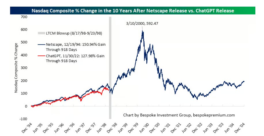
The following chart was just released by Bespoke Research and it visually shows what I was writing about in our most recent posting.
The GREY vertical line below shows the overlapping dips of 1998 and 2026. The RED line shows the current stock bull market from the bottom of the 2022 bear market to today. The DARK BLUE line shows the path and subsequent peak of the 1990’s Dot.com Bubble (and the resultant drop) and we are likely to track and then far exceed that past parabolic upward stock market move. We hold the goal of moving to safety near the top, as I did in all prior Secular Bear Markets going all the way back to the early 1980’s. So, the idea is that the current stock market red line will likely continue to track the 1990’s stock market blue line (but even more powerful this time?).
.
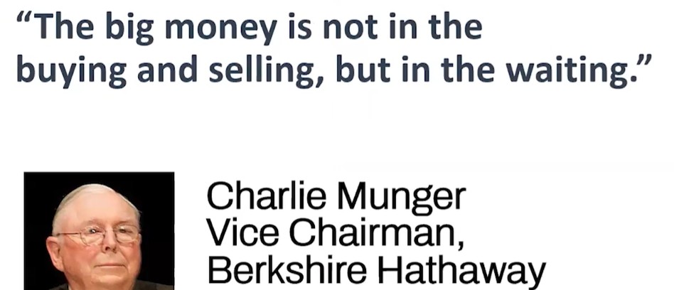
From the great Charlie Munger… the brain behind Warren Buffett’s Berkshire Hathaway:
.
SUMMARY: I’m still very bullish, but I feel that the weakness of June and July (that I warned about*) may continue awhile longer. If the market instead moves higher from today until late September, and it could because this is a very strong Secular bull market, then we might get some additional weakness in October before heading much higher again. Gold and crypto are bottoming, that seems clear to me. “Low risk” bonds are dangerous. We are likely to hit record stock market highs before the end of the year.
- = That May call was based on unhealthy macro and weak economic fundamentals; the more important “market internals” remain very strong and, in my opinion, there are zero signs of a big market top forming.
Thanks for reading!
Steph